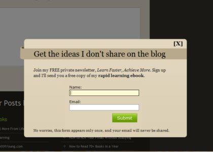
My design team and I have been experimenting with an in-window subscription pop-up for ScottHYoung.com.
This is where an in-window display (like the image above) asks if you’d like to join a free newsletter. They have been increasingly popular on the blogosphere, arguably because they work well–they turn casual visitors into subscribers.
I was reluctant to try one out, since I find them mildly irritating when done inappropriately, and I know plenty of readers have strong opinions about them. However, I’ve also spoken to several bloggers who have successful businesses that say the tool can double or triple the subscription rate (which in turn, can lead to double or triple their income).
My guess is that most of the regulars here already get updates via RSS or email, so they probably wouldn’t even notice. For the rest, the popup is set to only appear once, after you’ve finished reading the article, so I’m experimenting with the least aggressive version first.
What are your thoughts on the popup and subscription popups in general?
Hate them? Couldn’t care less? I’d like to get some of your thoughts in the comments.

 I'm a Wall Street Journal bestselling author, podcast host, computer programmer and an avid reader. Since 2006, I've published weekly essays on this website to help people like you learn and think better. My work has been featured in The New York Times, BBC, TEDx, Pocket, Business Insider and more. I don't promise I have all the answers, just a place to start.